Redesigning Trust for a Student-Led Tech Consultancy
Date
Jan - Feb 2025
Role
Lead UX Designer
Team
Kristie Chu (UX Designer) Drew Moulton (Developer)
Tools
Figma, Figjam
SUMMARY AND IMPACT
I led the UX strategy and design overhaul to reposition OSC as a legitimate, reliable, and human-centered consultancy. This wasn’t just a visual refresh, it was a strategic intervention. Through competitive audits, user interviews, and iterative testing, we uncovered what builds trust in tech organizations: clarity, transparency, and emotional resonance. I translated these insights into a new information architecture, visual system, and interaction model that elevated OSC’s brand and unlocked engagement.
Through iterative design and usability testing, the redesign significantly improving overall user experience.
↑
45
Task Success
↓
67
Navigation Time
↑
64
User Satisfaction
Overview
THE ISSUE

PROBLEM STATEMENT
Research
COMPETITIVE AUDIT
We compared OSC against 4 other student consulting/tech groups. Trust-building patterns emerged:
Clear service descriptions
Visible team page
Testimonials or portfolio of past work
Transparent timelines and expectations
Consistent branding and visual identity
SURVEYS & INTERVIEWS
Through surveys with 30 participants and interviews with 7, we identified distinct needs for students and clients, and where their frustrations overlapped.
Clear meeting times, application cycles, goals, engaging activities.
Contact info, past work, list of services, rough pricing
SYNTHESIS
Through surveys with 30 participants and interviews with 7, we identified distinct needs for students and clients, and where their frustrations overlapped.
PERSONAS
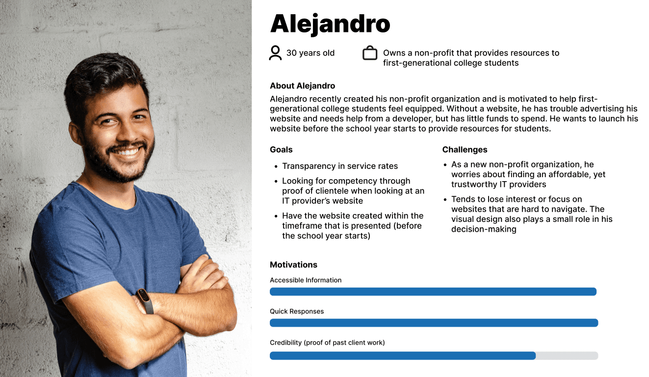
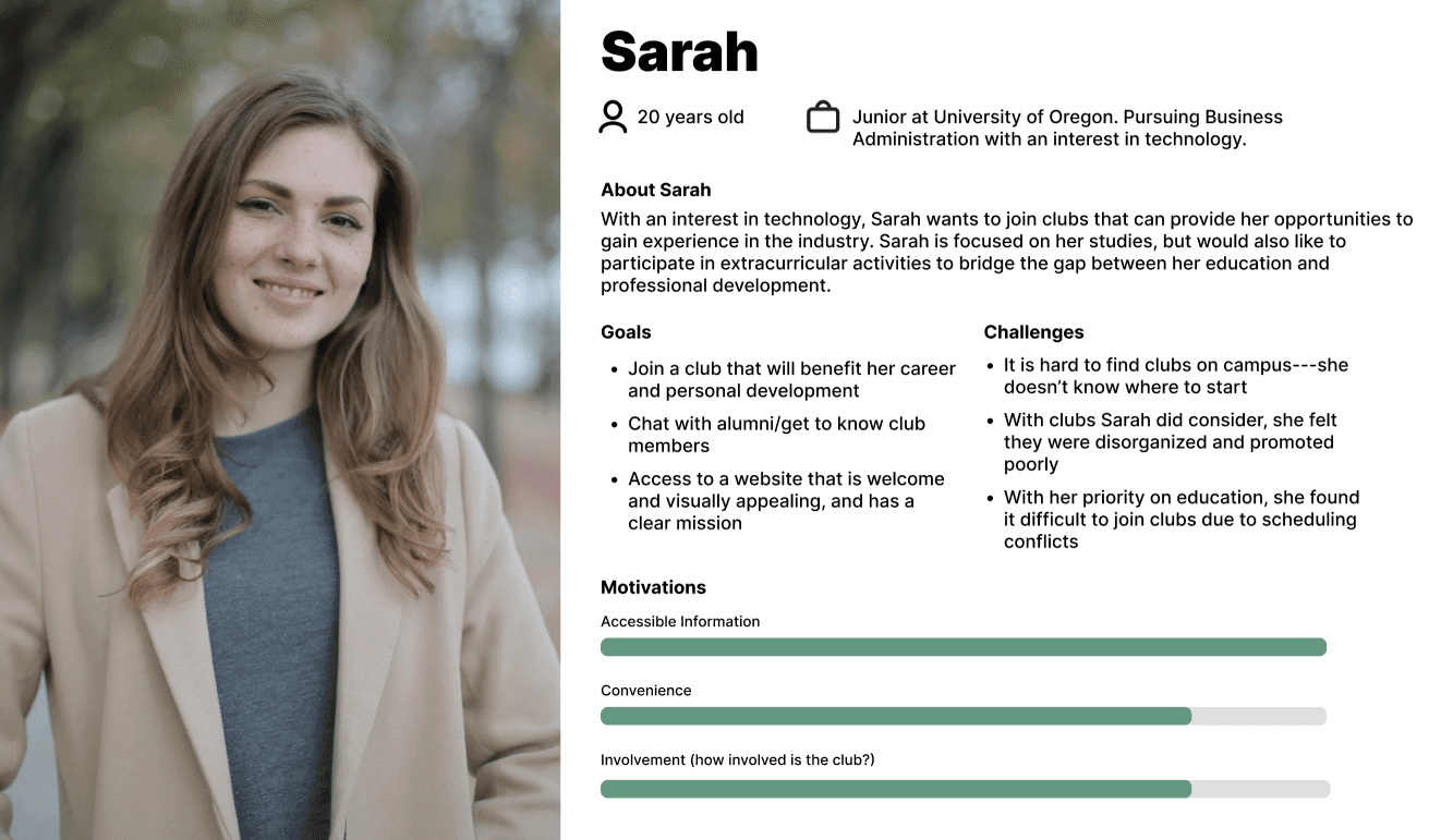
One representing students seeking professional growth, and another representing clients in need of reliable tech support. Creating these personas helped humanize our data, guiding our design decisions with real motivations and pain points in mind.
USER JOURNEY MAPS
By visualizing each step of their journey from discovering the club to contacting us or joining, we identified key opportunities to make the experience clearer, more trustworthy, and more engaging.
We found that these elements could be a target focus to improve the experience for students and clients:
Adding portfolio of our work
Adding a team member page
Simplifying jargon while being specific about our services
Prototyping
WIREFRAMING
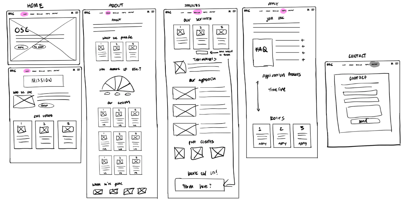
After defining key opportunities from our research and journey maps, and finalized the information architecture, we began sketching low-fidelity wireframes to visualize layout ideas and information hierarchy. These early wireframes helped us quickly test content structure and navigation before investing in visuals.
WIREFRAMING AND USER FEEDBACK
Once we aligned on the flow, we refined them into mid-fidelity prototypes to validate usability and content clarity with users. Through testing our mid-fi prototypes, participants emphasized the need for:

WIREFRAMING
Once we aligned on the flow, we refined them into mid-fidelity prototypes to validate usability and content clarity with users. Through testing our mid-fi prototypes, participants emphasized the need for:

Testing
REVISIONS
All 6 participants have noted that the app has a clean interface and is easy to navigate. However, there were some feedback and concerns about the app which we had addressed and made several iterations below.
Issue 01 - Lack of Clarity
Issue 02 - Wait... Your Services are Free?
Our client participants emphasized the need to center the client and our work for clients; they highlighted that we should put our emphasis on our free consultation services throughout the website.
We fixed this by emphasizing our free services in the “Home” page and “About” page.
REFLECTION
Key Takeaways
I really enjoyed this project since I got to do brainstorming sessions with the other designer, Kristie (also shout-out to our developer, Drew for developing the website within a day or two and for working around our design-thinking). Being able to constantly gather feedback from users was an impactful experience for me to leverage in my future projects. Here are some takeaways I had:
Balance your users: It’s important to remember to balance your users when designing for multiple audiences. Without realizing, I was prioritizing designing for students, but had to remind myself to also forefront the needs of clients.
Asking the right questions: We had several hiccups interviewing users since we did not go over these questions with others beforehand. To ensure a smooth process interviewing/testing, it’s good to go over the questions with non-users prior to asking users. By doing so, we can get insightful and valuable answers by adjusting and fixing our questions as needed.


